Home

Mindfulness Yoga Club

Mindfulness Yoga Club is focused on creating a community for aspiring yogis to begin and deepen their yoga practice.
Click here to visit website
Facebook
Twitter

Contact.

Got a project in mind? Feel free to reach out to me for a free consulation
live long and prosper

Copyright 2020 © All rights Reserved.

Canvas boutique hotel

Understanding the Challenge: 

As the business expands, additional channels are required to promote growth. For Canvass Boutique Hotel, establishing a website is essential to enhance their business prospects. They require a website capable of showcasing the hotel’s features and facilitating online reservations for those interested in booking accommodations will be able to accept online reservation to those who are interested in booking an accommodation with their hotel.

The Solution Presented: 

Develop a fully responsive and functional website to highlight the hotel’s features. Incorporate a booking platform that facilitates online reservations for hotel rooms. Utilize WordPress as the content management system (CMS) to empower administrators in updating the website content effortlessly.

Behind the Scenes: 

Throughout the process, we crafted both low and high fidelity mockups and presented them to the stakeholders. Once we received approval, development commenced. However, challenges arose when the reservation journey shifted due to the company changing the third-party reservation plugin. We had to adapt the design and accommodate the new reservation flow. After completing the entire website, we uploaded it to the live server.

The Result: 

Room reservations experienced a 65% increase since the website update. Data indicates that the streamlined reservation process on the website has significantly contributed to customers making reservations with ease. Overall, stakeholders are highly satisfied with the investment made in updating the website.

Cashless expo

Understanding the Challenge: 

As part of the Philippine Government’s initiative to promote digital payment adoption among local businesses, they aim to develop a website to encourage registration for a three-day event. Modernizing businesses in the Philippines is a key objective for the government this year as part of the digitalization of the economy. The website will play a crucial role in promoting this initiative by facilitating registrations for those interested in participating in the event.

The Solution Presented: 

Develop a single-page website showcasing all participating merchants and sponsors of the event. Include sections for both visitor and exhibitor registration. Additionally, integrate features such as event information, media links, frequently asked questions, and contact information with a form for interested parties to reach out to the event organizers.

Behind the Scenes: 

The initial plan was to develop a multi-page website, but we transitioned to a single-page, fully functional website. I began by gathering all the necessary information and crafting the design. Afterward, I created the prototype and presented it to the stakeholders for approval. Once approved, development commenced, and product demos were scheduled in accordance with agreed-upon timelines. Upon completion of the website, I proceeded to upload it to the live server.

The Result: 

The event was deemed successful, as there was a significant influx of registrations recorded through the website. The number of visitor registrations exceeded initial expectations, indicating strong interest and participation.

mindfulness yoga club

Understanding the Challenge: 

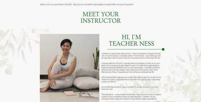
Embarking on her path as a wellness coach, Ness, the founder and Instructor of Mindfulness Yoga Club, envisioned broadening her reach through establishing an online presence. Alongside the development of her social media channels, she sought my assistance in creating a website to extend her outreach and would be able to schedule classes through her website.

The Solution Presented: 

Create a website to assist Coach Ness in expanding her reach. WordPress has been chosen as the CMS for the site, leveraging Coach Ness’s familiarity with this platform. The design will be curated to align with Coach Ness’s wellness approach, reflecting her unique style and enhancing the overall user experience. We added a booking system so that interested people can book a schedule with coach Ness.

Behind the Scenes: 

Throughout the development process, we meticulously crafted and thoroughly tested low-fidelity prototypes. User feedback was instrumental in refining the website’s architecture and features, ensuring optimal usability for all user personas. In terms of UI collaboration, while the client provided content, we prioritized maintaining a cohesive visual aesthetic. Our recommendation to maintain a consistent background across all product presentations resulted in a polished and unified visual experience.

The Result: 

Since the website went live, sign-ups have doubled, prompting Coach Ness to open multiple schedules on her website to accommodate the surge in registrations. The website and booking system have played a pivotal role in helping Coach Ness widen her reach and foster stronger connections with her audience.

Understanding the Challenge: 

Telematico has been at the forefront of IT services in the Philippines for over a decade, pioneering innovation in the industry. Recognizing the need to align with evolving business goals, the company has made the decision to revamp its outdated website and create a new online platform that reflects its commitment to excellence.

The Solution Presented: 

Create a website that not only highlights the company’s services but also showcases its range of products for current and prospective customers. Given that the old website has been in place for the past decade, updating the website structure is imperative. It’s crucial to ensure that the new website competes effectively with the company’s competitors and provides the company with the advantage it needs to thrive.

Behind the Scenes: 

During the development journey, we intricately designed and extensively tested low-fidelity prototypes. User feedback played a pivotal role in honing the website’s architecture and features, ensuring optimal usability for every user persona. In terms of UI collaboration, while the client contributed content, we emphasized the importance of upholding a unified visual aesthetic. Our recommendation to retain a consistent background across all product presentations culminated in a refined and cohesive visual experience.

The Result: 

Telematico’s revamped website has surpassed the company’s expectations. Not only does it boast a modern appearance, but it also presents the products and services with clarity. Navigation through the website is seamless, ensuring a top-notch customer experience.

Ronstan and Ryan

Understanding the Challenge: 

With over 5 years of experience in the clothing industry, Ronstan and Ryan are seeking to broaden their reach and serve international clients by establishing an online store. They have enlisted my expertise to assist them in designing and developing an e-commerce platform. The goal is to facilitate online order processing and shipment tracking, streamlining their operations and enhancing customer satisfaction.

The Solution Presented: 

Create an e-commerce website utilizing WordPress integrated with Woo Commerce as the content management system (CMS). This website will facilitate online orders, catering not only to local customers but also to international buyers. Additionally, it will feature order tracking functionality and inventory management capabilities to efficiently manage the site’s stock.

Behind the Scenes: 

Throughout the development process, we meticulously crafted and rigorously tested low-fidelity prototypes. User feedback played a vital role in refining the website’s architecture and features, guaranteeing optimal usability for every user persona. Regarding UI collaboration, although the client provided content, we underscored the significance of maintaining a cohesive visual aesthetic. Our suggestion to maintain a consistent background across all product presentations resulted in a polished and cohesive visual experience.

The Result: 

One month after completing the website development and deploying it to the live server, we observed a significant surge in orders through the website. An approximate growth of 200% indicates that the e-commerce website we developed is effectively maximizing its potential. The owners’ investment has yielded substantial returns, underscoring the success of the project.

cedar walk dentistry

Understanding the Challenge: 

Cedar Walk Dentistry seeks an online solution to broaden their market reach and establish a robust online presence. Their goal is to develop a platform that attracts customers and disseminates information about the services they provide, thereby enhancing their visibility and accessibility in the digital landscape.

The Solution Presented: 

Develop a responsive website to help increase online presence. Using WordPress as the CMS for ease of use and scalability for future development.

Behind the Scenes: 

During the development process, we meticulously designed and tested low-fidelity prototypes. User feedback was integral in refining the website’s architecture and features, ensuring optimal usability for every persona. In terms of UI collaboration, while the client provided content, we emphasized the importance of a unified visual aesthetic. Our recommendation for a consistent background across all product presentations led to a clean and streamlined visual experience.

The Result: 

53% Positive Impressions: Extensive positive feedback confirms the website’s effectiveness in meeting diverse needs. Users praise the customized content, intuitive navigation, and industry-specific features.

Enhanced Organization: The website’s structure underwent significant improvement, enabling customers to effortlessly browse services with efficiency.

Cedar Walk Dentistry’s revamped website exemplifies the impact of user-centered design in B2C environments. Prioritizing personalization, the website successfully caters to the distinct needs of its diverse audience. This results in a more organized, user-friendly, and ultimately, more profitable online experience.